
For this "Makeover Monday" design, I chose to design the data for the 20 largest solar power plants and turn it into an interactive dashboard. This dashboard makes the information easier to digest and the interactive elements display additional information.
This project was made for Data Visualization in SUNY New Paltz.
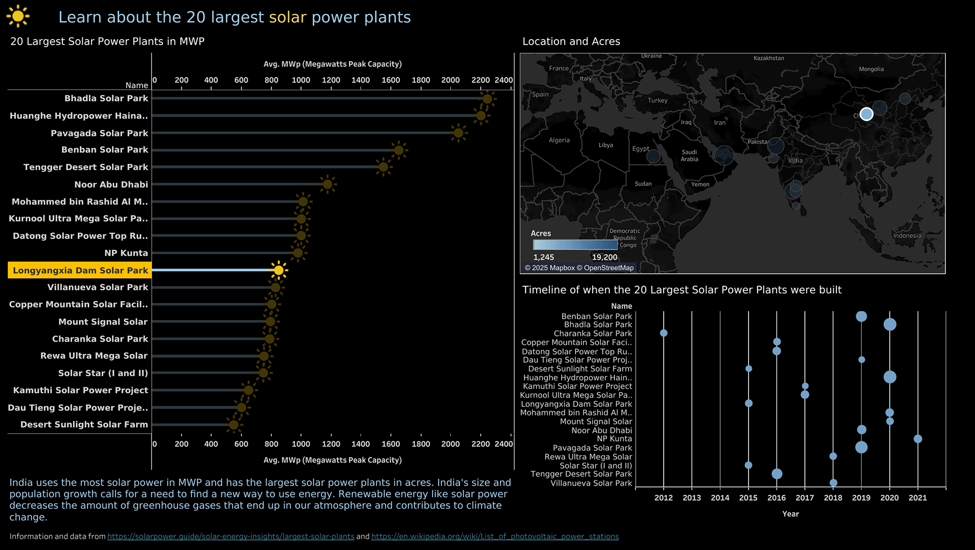
Image links to interactive dashboard.